Categories
Visual and Performing Arts

Google Street View Photography and the Visual Culture of American Poverty

Owen G. Clow

Google Street View Photography and the Visual Culture of American Poverty

Note on copyright: This essay in its original form contained numerous in-text images. Out of an abundance of concern, these have been deleted and replaced with offsite links to the same images.

In May of 2007, a press release on the official Google Maps blog heralded “a new feature that will further enhance your ability to understand the world through images—Google Street View.”[1] Initially limited to the downtown areas of a few American cities, Google Street View (GSV) was the product of a complex system of car-mounted cameras and algorithmic image manipulation. At the heart of the project was a panoramic camera affixed to the roof of a car. This car would drive around each city, take pictures at regular intervals, composite them together into a fully contiguous panorama, and then load each interval into Google Maps, mapping the spatial coordinates given by the position of the vehicle on the street onto the corresponding Cartesian space of Google Maps.[2] In the intervening thirteen years, GSV has blossomed, both in geographical scope and technological sophistication.[3] As Street View vehicles continue towards their ultimate goal—traveling and documenting every road on Earth—GSV has produced a unique culture of public digital spectatorship. It has also, more broadly, patterned how we see and understand the world around us.

Like many Google projects, GSV originated from an unspecific and broadly utopian impulse to make the world more accessible. There are legitimate reasons to celebrate its existence. GSV is a corporate product, but it is offered completely free of charge to all who access the website (or who download the free Google Earth software, which has GSV content embedded). There is the potential in GSV for genuine cross-cultural understanding: rather than traditional travel, which can be expensive and physically onerous, GSV offers those curious about the life and landscapes of distant places a first-person perspective on just that. Moreover, GSV can serve as a valuable pedagogical tool: over the years, Google has partnered with museums and other cultural sites to provide a “Street View” of their spaces and displays, enabling virtual access to students and patrons who are unable to visit in person.[4] And, of course, GSV offers the entertainment value of pure escapism: it isn’t just that it’s interesting to virtually navigate a mountain pass in Kyrgyzstan, it’s that it’s fun.

Grigorievka Gorge in Kyrgyzstan. Imagery from Google, cropped and reproduced by the author.

GSV has also been highly controversial. It is, after all, a corporate surveillance project which renders the public landscape—not just trees and buildings but cars, people, animals, et cetera—permanently visible and permanently accessible. GSV photography is by definition nonconsensual. Within a year of GSV’s initial release, Google responded to complaints along these lines by adding an algorithm which procedurally blurred human faces, license plates, and other specifically identifiable elements of these images.[5] Even with this addition, however, privacy concerns underwrite much of the public discourse surrounding GSV, and Google has spent substantial resources trying to reconcile its practice with laws surrounding personal privacy in a number of states. Germany, notably, remains largely unmapped by GSV due to legal obstacles.[6] Sociological research has implicated GSV in perpetuating classist attitudes towards working class communities.[7] And, among some critics, there remains a distinct feeling of unease at the notion that this technological project to create a visual record of the entire world is owned and controlled by an incomprehensibly powerful corporation worth over one trillion dollars.[8]

The inherent tension between GSV’s utopian concept—enabling “people everywhere to virtually explore the world”—and the sophisticated apparatus of total public surveillance which drives the project has provided fertile soil for artistic exploration.[9] One of the earliest visual projects involving GSV material, Jon Rafman’s ongoing 9 Eyes series attempts to capture the disorienting experience of total technological surveillance by curating GSV images that evoke tension, unease, and melancholia–offering, in Rafman’s words, “a sense of what it feels like to have everything recorded, but no particular significance accorded to anything.”[10] Michael Wolf’s Fuck You, one of several of the artist’s related projects, criticizes GSV’s technique of surveillance by cataloging various instances of blur-faced humans on GSV holding up middle fingers to the passing camera.[11] Tim Tetzner’s If The Eyes Can’t Touch (Blurred Modernism) highlights the visually jarring GSV dataset for Berlin, featuring rows of buildings with certain addresses blurred beyond recognition–the product of Google’s aforementioned capitulation to German privacy laws.[12] Of course, not all GSV art is an implicit critique of corporate capitalism or unstoppable surveillance. Jacqui Kenny’sThe Agoraphobic Traveller uses GSV to create a comparatively traditional landscape/cityscape photo-series, its component images curated specifically to produce an attractive and glamorous photographic aesthetic.[13] Kenny’s work is also noteworthy for its explicit approval from Google, which recently authorized the sale of a number of her prints for charity.[14] Implicit in all of these projects is the notion that GSV reveals something about both the land and the human relations that take place upon it. But what happens when the revelatory, documentary power of GSV is directed towards questions of wealth and poverty?

Untitled, 9 Eyes, Jon Rafman, 2020.

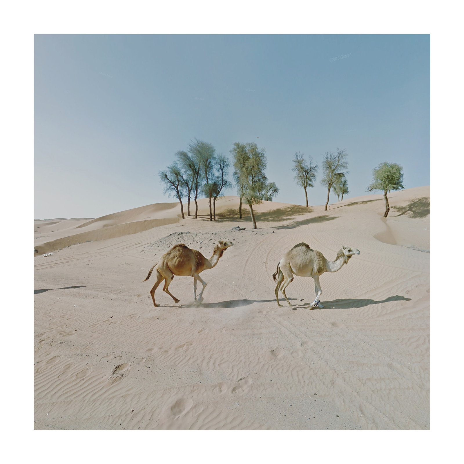
“Synchronized Camels, UAE,” The Agoraphobic Traveller, Jacqui Kenny, 2017.

This essay examines three projects which use GSV photography to explore and question American poverty: Doug Rickard’s A New American Picture, Justin Blinder’s Vacated, and Alex Alsup’s GooBing Detroit. The technology of GSV informs both the aesthetics and the message of these projects: the panoramic visual field of the Street View camera reveals the world in a way that closely resembles reality, just as it conceals the ideology of benevolent corporate surveillance that enables this kind of seeing. Furthermore, the processing of each image to remove faces, text, or copyrighted content often yields a disorienting mixture of supposed verisimilitude and obvious visual manipulation. While animated by an activist motivation generally similar to that of social documentary photography—the belief that visually documenting and publicizing social ills fosters empathy and encourages the amelioration of those ills—the art of Rickard, Blinder, and Alsup deviates from the genre’s traditional tendency toward human portraiture. Where traditional forms of social documentary photography portrayed poverty inscribed on the human body, “Street View” photography portrays poverty in the landscape, in architectural shifts, in dilapidated houses and overgrown yards, rather than in the furrowed brows and dirty feet of indigent families. In this sense, the message is limited by the medium: GSV is a tool that catalogs and documents “real” property–land and buildings which people own, build, exchange, and destroy–and, consequently, GSV enables one to see clearly the street address of a house, to see its features and its architecture, all the while obscuring the people on the sidewalk, the stoop, the porch, all of whom become literally faceless. Rickard, Blinder, and Alsup make a useful intervention, but GSV technology nevertheless constrains their work within a visual vocabulary of American poverty that centers property in lieu of people.

Social documentary photography: poverty in image and imagination

Situating these GSV projects within the artistic tradition of social documentary photography provides important context for understanding their messaging and impact. It is admittedly an unusual designation, given that neither Rickard, Blinder, nor Alsup actually photographed their subjects, or even held (for these purposes) a camera. More accurately, these artists assembled procedurally-generated photographs and arranged them into a serial structure, adding captioning and contextual information where necessary, thereby making them viable for public presentation. Their works each resemble a photo-series, and in most senses function as one. The artists under consideration are not photographers per se, but they share an activist motivation and aesthetic orientation with a long tradition of similarly-intentioned social documentary photography.

Social documentary photography is, as the name implies, a tradition of photography that is both documentary, in the sense that it aims to document the visible conditions of reality, and social, in the sense that this documentation explicitly engages with social problems. In America, historians often use the turn-of-the-century reformer Jacob Riis’s widely-reproduced How The Other Half Lives, a photographic expedition into the tenements, boarding houses, and working-class environs of New York City to clarify the origins of social documentary photography.

Taken during the 1880s, Riis’s photographs reflect an embryonic stage of development, both for social documentary and for photography more generally. In his so-called “magic lantern shows” for middle-class audiences, Riis supplemented his visual content with extensive text and oratory, later claiming in an autobiography that he was “no good at all as a photographer.”[15] The formal content of the images is likely familiar, but one visual theme bears deeper analysis: an emphasis on human bodies—wiry musculature and crevassed facial lines—as a site for “reading” the human condition of poverty.[16] For Riis, the importance of his photography was not simply that the living environment of poor workers was dangerous and unhygienic, it was that his audience would work towards the alleviation of these conditions. It is worth remembering as well that Riis, though seemingly sincere in his concern for the suffering of New York City’s working class, was allowed access to these spaces primarily through a close relationship with law enforcement (he had worked as a police reporter for a decade prior), and his interest in photographic documentation dovetailed neatly with the rapidly developing practice of police surveillance.[17] Riis’s aim was to turn the slums into a visual spectacle for a philanthropic middle class, and the moral degradation of urban poverty was, in his work, seen most clearly on the bodies of the poor.

“In Poverty Gap, West Twenty-Eighth St. An English Coal-Heaver’s Home,” Jacob Riis, How The Other Half Lives, circa 1890.

By the 1930s, as the Great Depression made it increasingly difficult to ignore widespread suffering among the American working class, the federal government had begun to take a serious interest in social documentary photography. The most productive result of this attention was a public photography project conceived under the auspices of the Resettlement Administration (which quickly became the Farm Security Administration), managed by the economist and amateur photographer Roy Stryker. Stryker, a true believer in the potential of social documentary photography to create public support for New Deal social welfare programs, contracted a number of professional photographers and sent them on journalistic “assignments,” where they were given a paycheck and some freedom in selecting their subjects.[18] Like Riis, the Farm Security Administration (FSA) photographers demonstrated a broad preference for human subjects, although Ben Shahn and Arthur Rothstein, among others, produced a number of compelling photographs of ramshackle living quarters and degraded structural foundations. Some of the most enduring images of the Great Depression were products of the FSA program: Dorothea Lange’s portrait of farmworker Florence O. Thompson—a photograph often referred to as “Migrant Mother”—is perhaps its most memorable product. In the photograph, Thompson’s gaze is set on something distant, far past the camera; the lacework of wrinkles along her forehead and around her eyes suggests that her lifestyle has aged her beyond her years; her children (we presume) hide their faces entirely. The documentary value of the photograph was not in its ability to capture something specific about the conditions of poverty; indeed, research has shown that Lange’s minimal description of Thompson’s work and circumstances was somewhat inaccurate.[19] Rather, the value of the image was in its ability to foster empathy for the subject, to force the audience to connect a visible human face to the experience of destitution, and to transform this subjective empathy into support for the social welfare efforts of the federal government. Stryker himself called Lange’s portrait of Thompson “the picture,” and regarded it as the most successful photograph of the entire project.[20] Thompson, for her part, told a reporter in 1978, “I wish she hadn’t taken my picture.”[21]

Compare: “Destitute pea pickers in California,” Dorothea Lange, 1936 (the “Migrant Mother” photograph); “Migrant agricultural worker’s family,” Dorothea Lange, 1936, same subjects.

Social documentary photographers concerned with poverty have come to acknowledge a fundamental tension in their own project: if the ethos of the form demands that the audience see poverty as a problem of individual human suffering, then how does the photographer capture poverty, as manifested on the human subject, without rendering that subject pathetic or pitiable? Riis, and to some extent the FSA photographers, viewed the people they photographed as cautionary objects for a middle-class audience. The purpose of documenting their plight was to inspire a sensibility that poverty robs the poor of their dignity.

But, to their credit, later practitioners in the field have taken other paths. Milton Rogovin’s work, in particular his Lower West Side series,represents an important intervention in the form.[22] In 1972, Rogovin, a left-leaning optometrist who picked up photography after being effectively blacklisted by the House Committee on Un-American Activities fifteen years prior, began photographing residents of Buffalo, New York’s Lower West Side, which at the time had the highest rate of unemployment in the city.[23] Over a twenty-year period, Rogovin returned to photograph the same places, the same families. While no less given to portraiture than his predecessors, at the core of Rogovin’s work is a sense of dignity and autonomy in his subjects, and an understanding that social documentary photography could serve the interests of the poor without pitying or pathologizing them. While contemporary artists often recognize the “pitiable poor” as an avoidable trope, the degree to which activist photographers negotiate this problem successfully is often uneven, as common debates about “ruin porn” attest, and the role of the human subject in social documentary photography of the poor remains fraught.[24]

Compare: Untitled FSA photograph, Theodor Jung, 1936; Untitled, from Lower West Side series, Milton Rogovin, 1972.

“Street View” as a formal intervention

How, then, can GSV technology intervene on this fundamental representational problem in social documentary photography? Doug Rickard’s A New American Picture shows one potential avenue. Along with Jon Rafman, Rickard was one of the forerunners of GSV art, and A New American Picture represents one of the earliest attempts to illuminate the problem of poverty, in particular, through the use of GSV and the artistic arrangement of its content. According to Rickard, the “project started with a focus on African American communities to see what they looked like on the heels of our history,” but he soon expanded his project away from “African American communities” and into “broken areas as a whole.”[25]

The social documentary impulse in Rickard’s art is only broadly directed at an activist purpose; rather than subjective empathy, the images as a whole tend to inspire a melancholy distance from the subject. This is not to say that the images themselves are uninteresting, however. In one particularly haunting shot, “Okeechobee, FL,” the blurred face of a child stares directly into the camera, the backdrop a grid of off-white prefabricated houses. In “Atlanta, GA,” a similarly-inscrutable child bikes past a pair of boarded-up houses, the oversaturated blue of the sky muting the already-dull hues of the built landscape. The low-resolution quality of these photographs, itself an artifact from GSV’s earliest technology, amplifies the not-quite-real sensation Rickard intentionally evokes.

The presence of people in these images serves less to facilitate an emotive connection to the audience and more to suggest their complete alienation. But we see poverty not in the human subject as much as we read it in the mise-en-scène: the prefabricated houses, the upturned bicycles, even the featureless pit of sand underneath the child’s feet. In A New American Picture, poverty lives in the inanimate landscape; the spectral figures that haunt it are human, we know, but their featurelessness prevents identification and, by extension, empathy.

Atlanta, GA, A New American Picture, Doug Rickard, 2012.

Okeechobee, FL, A New American Picture, Doug Rickard, 2012.

While Rickard’s work is largely concerned with “finding” otherwise art-gallery quality photographs through GSV, Justin Blinder’s Vacated offers a more conceptually sophisticated approach to the representational problem of American poverty. Vacated draws from GSV imagery from New York City, and, in Blinder’s words, “reflect[s] the complexities of social impact and urban change in gentrifying neighborhoods.”[26] Blinder uses an array of manipulation techniques—cross-fades as well as .gif animations—to juxtapose different GSV iterations of the same scene, demonstrating change over time in a single image.[27]

Initially commissioned by the arts organization More Art to show “how New York City had changed under the twelve-year Bloomberg Administration,” Blinder found his sites through searching a New York City Department of Planning database for vacant properties and reverse-engineered the historical image data from GSV.[28] Google had not initially let its audience view older imagery of any given place; within a year of the project’s release, however, Google added a “Time Machine” feature that allows the user to easily view the material that Blinder had needed to extract from GSV manually.[29] The social commentary in Blinder’s project comes through quite clearly: gentrification modifies the urban landscape in ways that necessarily destroy the built environment and, by extension, the visual structure of community. Each image captures a transformation, but in each case it evokes a sense of destruction rather than  rejuvenation.

But Vacated’s intentional focus on buildings and structures underscores a fundamental and largely inescapable aspect of art through GSV: the medium itself is a tool for the documentation of land—and land, mediated by capital, is property. The element in Blinder’s images that changes is not the visible human relationships to their environment, it is simply the environment itself. We see in one image the grotesque form of a half-built glass-plated obelisk rising over a street, but the relationship being visibly reconfigured is one of property rather than of people. Or, perhaps, we know that urban development initiatives and real estate contractors are groups of people–but instead of seeing them, we see the visible effects of their negotiations. Vacated highlights the visual and spatial transformations of gentrification, but it cannot connect these transformations to the social lives of those affected through the image alone. The architectural historian Marta Gutman, who contributed an essay for Vacated’s exhibition at the MOMA in 2013, felt similarly: in contrast to the immense human suffering of being evicted or otherwise forced from one’s home, “the cache of photographs, captured by Google Street View, can only hint at the loss.” “Do I fault Blinder for being incomplete?” she continued. “He is recording violence, even if he won’t admit it, and his record is useful. It’s up to all of us to act.”[30]

Untitled, Vacated, Justin Blinder, 2013.

Untitled, Vacated, Justin Blinder, 2013.

Like Vacated, Alex Alsup’s ongoing GooBing Detroit project attempts to show the process of urban decay through time-lapse techniques. By taking the same shot of the same scene years apart, GooBing Detroit highlights the gradual decay of built spaces in Detroit. Alsup’s hook is clever, drawing on the fact that GSV imagery for Detroit largely began in 2008, in the early months of the Great Recession, and continues into the present. Some of Alsup’s images are visually arresting, and his use of in-frame captioning adds an element of starkness to the story his assembled images seem to tell.

One representative example, “Mackay Street, Detroit,” begins in 2009, focused on a row of four detached houses, one of which seems to be under construction. Three of these houses have front-facing porches, relatively manicured lawns, and embody in nearly every respect the archetypal single-family suburban house regularly associated with the ideal life of the American suburbs. By 2011, the unfinished house has been obscured entirely by overgrown shrubbery; in 2013, beneath an overcast sky, three out of four houses are in obvious disrepair, the lawns resemble a wilderness, and even the sidewalk is cracked as if by tectonic forces. The final shot, from 2015, carries the sense of the calm after the storm–but the damage has been done, and even the final remaining house, now thoroughly uninhabitable, has lost most of its roof. The temporal aspect of GooBing Detroit offers, in this sense, the ability to infer a narrative simply through visual/environmental cues.

Yet the project at large feels somewhat hollow and lifeless—which may, itself, be the emotive intent of the work. By dwelling on the material debris of the foreclosure crisis, Alsup’s work runs the risk of sidelining the human experience from the visual record. GooBing Detroit has a clear preference for residential properties, but it is up to the audience to imagine the process through which each house became vacant, became a ruin, and became an empty field. Alsup, to his credit, seems aware of the limits of GSV as a visual medium, and supplementary textual material on the project’s website leads to a more comprehensive accounting of the social problem of foreclosure. But the visual material of GooBing Detroit nonetheless privileges residential property as the photographic subject, rather than the residents themselves. The ultimate result is a series of stark, depressing images that fail to evoke a sense of human empathy because the human subject is absent almost entirely from the scene.

Mackay Street, Detroit, Alex Alsup, GooBing Detroit, 2019.

Hazelridge Street, northeast Detroit, 2009-2018, GooBing Detroit, Alex Alsup, 2019.

If the fundamental question underlying all these projects is whether the technology of GSV enables a new way of visualizing poverty, then the answer is a resounding yes. It absolutely does. But the ability to simply see poverty—and other social and economic issues—in novel and compelling ways is of ultimately limited utility.[31]

The GSV camera obscures as much as it reveals. Where early practitioners of social documentary photography saw the shocking spectacle of the urban slums or the hardscrabble lives of indigent “Okie” farmworkers, they conceived of the core foundation of the social problem at hand as one of human suffering. The visibility of human pain was often the point. Conversely, GSV algorithmically obscures the human form and any of its identifying features. We cannot see suffering on the faces of the poor, so we read it instead in the land upon which they live. Using corporate surveillance software designed to document land and property as a medium compounds this problem, even when artists like Blinder or Alsup try to turn the software against itself. To whatever extent the social documentary form depends on developing empathy for human misery, GSV redirects this human relation to the lifeless visual form of property. It is from this visual representation of property that the audience must extract some meaningful reflection not just on poverty, but on social relations more generally–and the economic system which determines them.

The impossibility of transformative art under capitalism is by no means a new complaint among socially conscious artists, and it is what lurks underneath the representational problem of art with GSV.[32] Inasmuch as these GSV artistic projects redirect human empathy towards property, property itself is embedded within the system of capital simultaneously obscured and revealed by the form of GSV software. In his book Photography After Capitalism, the art historian Ben Burbridge offers a close reading of Jon Rafman’s aforementioned 9 Eyes project. Burbridge envisions “mass photography” such as GSV as the sort of “participatory, egalitarian, and inclusive experiences of making, using, and accessing photography” which “signal precisely the principles according to which society could and should be restructured.”[33] It is a lofty dream. The free, easy, and massive public access to GSV even suggests that it might be attainable. But what Rickard, Blinder, and Alsup’s work reveals, unfortunately, is that GSV’s innate emphasis on land and property over the identifiable human subject runs contrary to this ideal, and that the social documentary form demands engagement with common humanity that no corporate surveillance software, as yet, can offer.

Bibliography

Anguelov, Dragomir, Carole Dulong, Daniel Filip, Christian Frueh, Stephane Lafon, Richard Lyon, Abhijit Ogale, Luc Vincent, and Josh Weaver. “Google Street View: Capturing the World at Street Level.” Computer, June 2010.

Associated Press. “‘Can’t Get a Penny’: Famed Photo’s Subject Feels She’s Exploited.” Los Angeles Times. November 18, 1978, sec. B1.

Blinder, Justin. “Absence in Context: Recontextualizing Civic Data, Critical Cartographies, and Gentrification in New York City.” Ubiquity: The Journal of Pervasive Media 4, no. 1 (2015): 23–37.

Brown, Abbie, and Tim Green. “Virtual Reality: Low-Cost Tools and Resources for the Classroom.” TechTrends 60 (2016): 517–19.

Burbridge, Ben. Photography After Capitalism. London: Goldsmiths, 2020.

Cain Miller, Claire, and Kevin O’Brien. “Germany’s Complicated Relationship With Google Street View.” Blog. Bits: Business, Innovation, Technology, Society (blog), April 23, 2013. https://bits.blogs.nytimes.com/2013/04/23/germanys-complicated-relationship-with-google-street-view/.

Chau, Stephen. “Introducing… Street View!” Blog. Google Maps Blog (blog), May 29, 2007. https://maps.googleblog.com/2007/05/introducing-street-view.html.

Curtis, James. “Dorothea Lange, Migrant Mother, and the Culture of the Great Depression.” Winterthur Portfolio 21, no. 1 (1986): 1–20.

Danby, Susan, Christina Davidson, Stuart Ekberg, Helen Breathnach, and Karen Thorpe. “‘Let’s See If You Can See Me’: Making Connections with Google Earth in a Preschool Classroom.” Children’s Geographies 16, no. 2 (2016): 141–57.

Finnegan, Cara. Picturing Poverty: Print Culture and FSA Photographs. Washington: Smithsonian Institution, 2004.

Fulton, Christopher, ed. The Social Documentary Photography of Milton Rogovin. Lexington, KY: University Press of Kentucky, 2019.

Gandal, Keith. The Virtues of the Vicious: Jacob Riis, Stephen Crane, and the Spectacle of the Slum. New York: Oxford University Press, 1997.

Gansky, Andrew. “‘Ruin Porn’ and the Ambivalence of Decline: Andrew Moore’s Photographs of Detroit.” Photography and Culture 7, no. 2 (2015): 119–39.

Gutman, Marta. “Vacated (Justin Blinder).” Design and Violence (exhibition), January 21, 2015. https://www.moma.org/interactives/exhibitions/2013/designandviolence/vacated-justin-blinder/.

Jacobs, Frank. “Why Germany Is a Blank Spot on Google’s Street View.” Big Think, September 26, 2019. https://bigthink.com/strange-maps/germany-street-view.

Lyons, Siobhan, ed. Ruin Porn and the Obsession with Decay. London: Palgrave MacMillan, 2018.

Metz, Holly. “Milton Rogovin: Seeing the Forgotten Ones.” Labor History 38, no. 4 (1997): 508–24.

Natanson, Nicholas. The Black Image in the New Deal: The Politics of FSA Photography. Knoxville: University of Tennessee Press, 1992.

Power, Martin, Patricia Neville, Eoin Devereux, Amanda Haynes, and Cliona Barnes. “‘Why Bother Seeing the World for Real?’: Google Street View and the Representation of a Stigmatised Neighbourhood.” New Media & Society 15, no. 7 (2012): 1022–40.

Proctor, Nancy. “The Google Art Project: A New Generation of Museums on the Web?” Curator: The Museum Journal 54, no. 2 (2012): 215–21.

Rafman, Jon. “IMG MGMT: The Nine Eyes of Google Street View.” Art F City, August 12, 2009. http://artfcity.com/2009/08/12/img-mgmt-the-nine-eyes-of-google-street-view/.

Sandweiss, Martha. “Image and Artifact: The Photograph as Evidence in the Digital Age.” Journal of American History 94, no. 1 (2007): 193–202.

Shankland, Stephen. “Google Begins Blurring Faces in Street View.” CNET, May 13, 2008, Online edition. https://www.cnet.com/news/google-begins-blurring-faces-in-street-view/.

Stange, Maren. Symbols of Ideal Life: Social Documentary Photography in America 1890-1950. New York: Cambridge University Press, 1989.

Strangleman, Tim. “‘Smokestack Nostalgia,’ ‘Ruin Porn,’ or Working-Class Obituary: The Role and Meaning of Deindustrial Representation.” International Labor and Working-Class History 84 (2013): 23–37.

Stryker, Roy, and Nancy Wood. In This Proud Land: America, 1935-1943, as Seen in the FSA Photographs. Greenwich, CT: New York Graphic Society, 1973.

Thielmann, Tristan. “Linked Photography: A Praxeological Analysis of Augmented Reality Navigation in the Early Twentieth Century.” Blog. Beiträge, April 5, 2016. http://www.mobilemedia.uni-siegen.de/2016/04/05/linked-photography/.

Trachtenberg, Alan. Reading American Photographs: Images As History, Mathew Brady to Walker Evans. New York: Hill & Wang, 1989.

Wakabayashi, Daisuke. “Google Tops Market Cap Of $1 Trillion.” New York Times, January 17, 2020, New York edition, sec. B.

Warren, Spring. “Screen Captures: Americans on Google Street, an Interview with Artist Doug Rickard.” Boom: A Journal of California 2, no. 4 (2012): 18–26.

Wolinski, Paul. “Fully Automated Luxury Composition.” Journal of the International Association for the Study of Popular Music 7, no. 2 (2017): 8–15.


[1]     Stephen Chau, “Introducing… Street View!,” Blog, Google Maps Blog (blog), May 29, 2007, https://maps.googleblog.com/2007/05/introducing-street-view.html.

[2]     For a more comprehensive discussion of the technology behind GSV, see Dragomir Anguelov et al., “Google Street View: Capturing the World at Street Level,” Computer, June 2010.

[3]     Competitor software also exists, but this essay largely focuses on Google’s proprietary software as it is by far the most recognizable and most comprehensive of such programs.

[4]     Nancy Proctor, “The Google Art Project: A New Generation of Museums on the Web?,” Curator: The Museum Journal 54, no. 2 (2012): 215–21. For pedagogical applications, see, e.g., Abbie Brown and Tim Green, “Virtual Reality: Low-Cost Tools and Resources for the Classroom,” TechTrends 60 (2016): 517–19 or Susan Danby et al., “‘Let’s See If You Can See Me’: Making Connections with Google Earth in a Preschool Classroom,” Children’s Geographies 16, no. 2 (2016): 141–57.

[5]     Stephen Shankland, “Google Begins Blurring Faces in Street View,” CNET, May 13, 2008, Online edition, https://www.cnet.com/news/google-begins-blurring-faces-in-street-view/.

[6]     Claire Cain Miller and Kevin O’Brien, “Germany’s Complicated Relationship With Google Street View,” Blog, Bits: Business, Innovation, Technology, Society (blog), April 23, 2013, https://bits.blogs.nytimes.com/2013/04/23/germanys-complicated-relationship-with-google-street-view/. For a more current discussion of GSV in Germany, see Frank Jacobs, “Why Germany Is a Blank Spot on Google’s Street View,” Big Think, September 26, 2019, https://bigthink.com/strange-maps/germany-street-view.

[7]     See, e.g., Martin Power et al., “‘Why Bother Seeing the World for Real?’: Google Street View and the Representation of a Stigmatised Neighbourhood,” New Media & Society 15, no. 7 (2012): 1022–40.

[8]     Daisuke Wakabayashi, “Google Tops Market Cap Of $1 Trillion,” New York Times, January 17, 2020, New York edition, sec. B.

[9]     This quotation comes from the marketing copy on the GSV landing page at https://www.google.com/streetview/.

[10]    Jon Rafman, 9 Eyes, online photo-series, 2008-present (ongoing), https://9-eyes.com/. Quotation from Jon Rafman, “IMG MGMT: The Nine Eyes of Google Street View,” Art F City, August 12, 2009, http://artfcity.com/2009/08/12/img-mgmt-the-nine-eyes-of-google-street-view/.

[11]    Michael Wolf, Fuck You, online photo-series, 2010, http://photomichaelwolf.com/#fuck-you/1. Published in book format as Michael Wolf, FY (Berlin: Peperoni Books, 2010).

[12]    Tim Tetzner, If The Eyes Can’t Touch (Blurred Modernism), photo-series, 2018, http://www.timtetzner.com/files/Scharaun_BlurredModernism.pdf.

[13]    Jacqui Kenny, The Agoraphobic Traveller, online photo-series, 2016-present (ongoing), https://www.theagoraphobictraveller.com/.

[14]    Kenny’s website lists a forthcoming book version of The Agoraphobic Traveler in 2021. Google featured Kenny’s work in the “Stories” section of their website: https://about.google/intl/ALL_us/stories/agoraphobic-traveller/.

[15]    Maren Stange, Symbols of Ideal Life: Social Documentary Photography in America 1890-1950 (New York: Cambridge University Press, 1989), 26.

[16]    “Reading,” in this sense, suggests a certain critical relation to photography detailed in Alan Trachtenberg, Reading American Photographs: Images As History, Mathew Brady to Walker Evans (New York: Hill & Wang, 1989).

[17]    Keith Gandal, The Virtues of the Vicious: Jacob Riis, Stephen Crane, and the Spectacle of the Slum (New York: Oxford University Press, 1997), 11-12.

[18]    For more on the FSA photography project, see Cara Finnegan, Picturing Poverty: Print Culture and FSA Photographs (Washington: Smithsonian Institution, 2004) and Nicholas Natanson, The Black Image in the New Deal: The Politics of FSA Photography (Knoxville: University of Tennessee Press, 1992).

[19]    Martha Sandweiss, “Image and Artifact: The Photograph as Evidence in the Digital Age,” Journal of American History 94, no. 1 (2007): 195-196.

[20]    Roy Stryker and Nancy Wood, In This Proud Land: America, 1935-1943, as Seen in the FSA Photographs (Greenwich, CT: New York Graphic Society, 1973), 19, quoted in James Curtis, “Dorothea Lange, Migrant Mother, and the Culture of the Great Depression,” Winterthur Portfolio 21, no. 1 (1986), 1.

[21]    Associated Press, “‘Can’t Get a Penny’: Famed Photo’s Subject Feels She’s Exploited,” Los Angeles Times, November 18, 1978, sec. B1.

[22]    For a more comprehensive historical treatment of Rogovin, see Christopher Fulton, ed., The Social Documentary Photography of Milton Rogovin (Lexington, KY: University Press of Kentucky, 2019).

[23]    Holly Metz, “Milton Rogovin: Seeing the Forgotten Ones,” Labor History 38, no. 4 (1997), 509-511.

[24]    For a discussion of “ruin porn,” see Andrew Gansky, “‘Ruin Porn’ and the Ambivalence of Decline: Andrew Moore’s Photographs of Detroit,” Photography and Culture 7, no. 2 (2015): 119–39; Siobhan Lyons, ed., Ruin Porn and the Obsession with Decay (London: Palgrave MacMillan, 2018); or Tim Strangleman, “‘Smokestack Nostalgia,’ ‘Ruin Porn,’ or Working-Class Obituary: The Role and Meaning of Deindustrial Representation,” International Labor and Working-Class History 84 (2013): 23–37.

[25]    Spring Warren, “Screen Captures: Americans on Google Street, an Interview with Artist Doug Rickard,” Boom: A Journal of California 2, no. 4 (2012), 18-19.

[26]    Justin Blinder, “Absence in Context: Recontextualizing Civic Data, Critical Cartographies, and Gentrification in New York City.,” Ubiquity: The Journal of Pervasive Media 4, no. 1 (2015), 34.

[27]    For an example of crossfading and .gif animation, see, respectively, the first and second attached images from Vacated.

[28]    Blinder, “Absence in Context,” 30.

[29]    Ibid, 101.

[30]    Gutman, Marta. “Vacated (Justin Blinder).” Essay in Design and Violence (exhibition), January 21, 2015. https://www.moma.org/interactives/exhibitions/2013/designandviolence/vacated-justin-blinder/.

[31]    The notion of panoptic street-level photography predates GSV, but the notion of using this method to document poverty is wholly novel. Rand McNally “Photo-Auto Guides” offer an early twentieth century example of a similar project. This topic remains underexplored; see Tristan Thielmann, “Linked Photography: A Praxeological Analysis of Augmented Reality Navigation in the Early Twentieth Century,” Beiträge (blog), April 5, 2016, http://www.mobilemedia.uni-siegen.de/2016/04/05/linked-photography/.

[32]    For commentary outside the realm of visual arts, consider Paul Wolinski, “Fully Automated Luxury Composition,” Journal of the International Association for the Study of Popular Music 7, no. 2 (2017): 8–15. Wolinski, an experimental musician as well as a scholar of popular music, considers whether algorithmically-generated music can “resist the pressures of capitalism.”

[33]    Ben Burbridge, Photography After Capitalism (London: Goldsmiths, 2020), 19.

Categories
Visualizing Urban Poverty

Blighted: Slums, Renewal, and Photographic Depictions of New York’s Poor

Ryan Sullivan

Introduction 

For many years, West 98th and 99th Streets between Columbus Avenue and Central Park West was the site of a vibrant African-American quarter known as the “Old Community.” The area started out as a small settlement, but by the 1920s, had blossomed into something of a miniature Harlem with its own Renaissance. Billie Holiday, Arturo Schomburg, and the actress Butterfly McQueen of “Gone with the Wind” fame all called the Upper West Side neighborhood home. After the Second World War, the Old Community was still populated by African-Americans, but bohemians and free spirits had given way to poor and working-class families. Despite their lack of wealth, residents possessed a tremendous amount of comradery, togetherness, and local pride. It was the type of place where households relied on their next-door neighbors as much as they did each other. As Jane Jacobs would say, there were “eyes on the street,” her metaphor for the natural protective surveillance that occurs on vibrant city blocks. Jim Torain of the West 99th and 98th Street Old Community Association described the area as “like a big extended family.” Linda Burstion, who grew up on 98th Street recalled; “it was just a great neighborhood to live in, I remember playing jacks, eating ices, playing stickball and dodgeball, jumping double Dutch and when it got really hot out, they would open up the fire hydrants.” This is not to say that the Old Community escaped the problems that plagued minority enclaves, but communal bonds and kinship ties provided residents with a strong sense of hope for the future. Then, almost overnight, the Old Community was gone.

The Old Community’s disappearance was the product of mid-century urban reform and slum clearance which culminated in the sweeping 1949 Federal Housing Act. The bill’s infamous Title I clause, “Slum Clearance and Community Development and Redevelopment” federally authorized $1 billion in loans to help cities acquire “slums” like Old Community for public or private use.  The law did not, however, require that affordable accommodations be built for ousted tenants, and many of those who lost their homes to demolition were not re-housed at all. The few that did get relocated found themselves in massive housing projects, cut off from the intimacy of street communities and segregated as never before. 

Renewal advocates relied on the word blight more than anything else to secure public and political approval for their efforts.  Blight, they explained, was a malignant disease that threatened to turn healthy areas into slums. But lawmakers included no legislative definition for blight, which allowed these local leaders and developers great discretion about where and what parts of the city were suitable for clearance and replacement. To demonstrate blighted conditions to a wide audience, Title I proponents used a range of visual aids including brochures, maps, and most importantly—photographs. Examining these images reveals a great deal about the attitudes and presumptions held in postwar America about the urban poor. 

The Birth of City Planning 

To understand how blight emerged as a concept, we must understand the professionalization of city planning. In its modern form, city planning is very much a response to the changing dynamics of urban America in the late 19th century and early 20th century. Rapid urbanization, immigration, and industrialization created lamentable living conditions which shocked middle class onlookers. Most agreed with pioneering documentary photographer and social reformer Jacob Riis when he said, “cities had become nurseries of crime, and of the vices and disorderly courses which lead to crime.” 

Riding the wave of popular urban reform movements, institutions like Harvard and Yale began granting degrees in city planning, urban design, and architecture. By the 1910s city planners were building a new lexicon of terms filled with quasi scientific metaphors. The first use of “blight” to describe urban areas is uncertain, but scholars have pointed to the area around the Brooklyn Naval Yard which was described in a 1911 edition of the New York Times, as “a blighted neighborhood.” In the mid-1920’s, C. Earl Morrow and Charles Herrick, two students at Harvard’s Graduate School of Landscape Architecture published an influential article in City Planning. In the essay, they defined blight as “… a district [where]  normal development has been frustrated. Ordinarily property values are an index of the situation: wherever property values fail to keep pace with the increase in other similar districts in the same city, or have decreased, the district may be termed a blighted district” Therefore, blight is defined as slowing of the property values in one portion of the city when compared to other parts of the city, the result of which is a hindrance to “normal development.” While Morrow and Herrick’s definition of blight has several weaknesses, it stands as a landmark. It is the first serious attempt to give a precise, scientific, urban definition to the word—and it placed the meaning of blight firmly within a capitalist framework that defined good and bad areas of a city narrowly on property values alone.

Despite the efforts of city planners to define blight using scientific and empirical data, the term remained vague and amorphous throughout the first half of the 20th century. The slum, being the ultimate nadir of physical urban conditions, was relatively easy to define, but blight was something that existed in the eye of the beholder. Without a universal definition, the only metric to judge blight was perception. In other words—we all know it when we see it.   With the term almost always applied to spaces where Anglo-American families did not live, blight became infused with racial and ethnic prejudice.  By mid-century, most city planners could not—or did not care to—distinguish blighted areas from minority areas and vice versa.

Photographs as Conveyors of Truth  

The birth of the modern city planning profession coalesced with the rise of documentary photography in the late 19th and early 20th centuries. During this time, many in the public believed photographs were inherently true and that cameras presented subjects as they really were. This credence also dominated Progressive reform and intellectual settings. Pictures thus became a reliable form of qualitative research and were used as evidence to advance the specific ideological underpinnings of the reformist vision in the areas of housing, philanthropy, education, and public health.  

Despite the insistence that photographs represented objective conditions, photographers and social reformers found themselves working harder and harder to establish the ideological meaning of the photographs they took. Jacob Riis, who made a career out of exposing urban conditions is an example of how ideology and photography are interconnected. Riis never allowed ambiguity to creep into his photos, not wanting his audience to draw conclusions that did not align with his reformist agenda. In lectures, Riis frequently included anecdotes about his subjects to advance ideological narratives that included the people photographed as well as his audiences. The result was a combination of entertainment and morality with photographs functioning as the mediated visual truth.  Even when he was not lecturing, Riis always presented his photos with captions and text, making sure that his interpretation was always clear.

Policymakers discovered the power of photographic interpretation when they sought to portray the poor during the Great Depression. The Farm Security Administration (FSA) desperately wanted to legitimize many of its controversial programs such as the resettlement of landless farmers, the building of model towns, and the establishment of rural cooperatives through publicity. FSA officials made calculated decisions over which photographs to include, how to present them, and what captions to write. The FSA documentary photographer thus became not only a cameraman “but a scenarist, dramatist, and director as well,’’ aiming at ‘‘not only the influencing of the subject before the camera, but also the influencing of the person looking at the finished print.” According to Tim Cressel, author of The Tramp in America: “FSA photography was an important propaganda tool that served to legitimate the New Deal . . . they [the photographs] were part of a national attempt to order society and nature through the application of rational scientific principles during a chronic depression . . . The images of migrants were a way of saying that things need to be made better for these people living disordered lives. They needed migrant camps—nicely ordered, geometric simulations of ‘normal life’, which the FSA also photographed.” 

The photographs used by urban renewal advocates may not have been as prominent as those of the FSA, but it is likely that Title I proponents were aware of the influence photographs had on the public. By employing this medium, they sought to combine scientific objectivity and rationalism with emotional appeal and popular understandings of the meaning and conditions of poverty to shape public opinion and further their ultimate agenda.  

“Demonstrations of Blight”

An invigorated push for urban redevelopment gained political steam once the Second World War ended. When President Truman signed the 1949 Housing Act, he proclaimed that the legislation “opens up the prospect of decent homes in wholesome for low-income families now living in the squalor of the slums”, and will equip “the Federal Government, for the first time, with effective means for aiding cities.” Idealists hoped the bill would uplift the poor, eliminate unsanitary conditions, and bring order to the messiness of urban life. But others, specifically businessmen and civic leaders, saw an opportunity to redevelop areas in strategic parts of their city that had experienced undesirable demographic and racial changes.

The Title I provision delegated leadership to local municipalities to acquire local lands for the purpose of redevelopment, and Robert Moses was soon named chairman of the Mayor’s Committee on Slum Clearance. Between 1949 and 1960, Moses made New York City the capital of renewal, planning thirty-five slum clearing projects, completing seventeen, and receiving $65.8 million in Title I funds. To justify and promote these urban renewal projects, Moses published brochures for each renewal site (See Figure 1 for an example). These brochures were made of glossy paper and filled with statistics, graphics, charts, and photographs. According to historian Samuel Zipp, “the clean, orderly feeling of the designs, bold titles, seemingly objective amassing of data and photographs bled to the edges of the page.”   This made for a heightened sense of contrast with the dark, seemingly all-pervasive decay on display in the uncaptioned photos. Moses instructed his underlings that he did not want long texts in the slum clearance publications: ‘‘It’s the schedules themselves, the plans and pictures that count with the statement that we mean business, that the procedure will be entirely fair and orderly and that hardships will be, so far as humanly possible, avoided.” Moses’s direction gave the impression that the brochure’s photographs captured objective slum conditions that could be universally understood and accepted. Taking cues from both Riis and FSA photographers, these brochures presented a powerful visual argument and further demonstrated how a sophisticated use of visual material can shape perceptions.

Given that the brochures were intended to justify the clearance of areas designated as ‘‘slums,’’ the most important section was entitled ‘‘Demonstration of Blight” (Figure 2).  Here, the authors described matters such as land use, the condition and age of existing structures, zoning, and population density. The photographs that displayed ‘‘blighted’’ conditions in the most persuasive manner explored three themes: empty lots, back alleys, and abandoned buildings. Empty lots (Figure 3) appeared twenty-two times in the brochures and represented the most popular depiction of blight. Moses and his team implied that when a building was missing, that space was underutilized and would eventually be filled by garbage. Back alleys appeared twenty times. Mostly dark, these photos indicated that portions of the buildings did not receive proper sunlight. Abandoned buildings appeared seventeen times. Once again, abandoned buildings were viewed as natural statements of urban blight. They had a similar representational function as empty lots; abandoned buildings were uneconomic and the fact that their owners had not repaired them meant they were beyond repair or that their owners were not optimistic about the profitability of these buildings.

Race equals Blight

Many images included in “Demonstration of Blight” emphasized elements that made the built environment appear disorderly, obsolete, and beyond repair. Squalor and idleness were often associated with Black and Latino neighborhoods. But surprisingly, people are centered in only a few photos. According to urbanist Themis Chronopoulos “in these types of photographs, the presence of people is incidental,” because Moses and his staff members viewed “blight as a physical problem that required physical solutions.”

But upon closer look, the human subjects included in the photos are much more than incidental passersby. In one photograph, two Black men appear to be chatting on a stoop (Figure 4). At first glance, one might think the picture is meant to show the decay of the townhouse behind them. But there is a more coded message being relayed. The two Black men appear to be conversing in broad daylight, implying idleness or even unemployment. In another image, a young man is pictured crossing the street (Figure 5). This photograph was intended to show that commercial establishments existed in residential buildings and that the people frequenting these stores were doing so in a disorderly fashion. Although this photo is meant to demonstrate blight, the neighborhood appears to be quite vibrant, active, and safe.  Taken on West 63rd street, this area was once called San Juan Hill— a minority community made up of Black and Latino residents. The only evidence of blight in this photo is its subject’s apparent ethnicity. In a third photograph, also taken in San Juan Hill, a grocery store is shown with a soft drink sign on the ground floor of a brownstone (Figure 6). This image made the point that commercial establishments existed in residential streets, which according to modernist planning theories was unacceptable. Further, there is a sign advertising furnished rooms and apartments in the photograph. This detail implied that some of the buildings had been converted into single-room occupancies, attracting low-income and possibly homeless people. A caption for this photograph asked the question: ‘‘Is this a place for a woman and her child?” Although the picture is not in focus, the woman and boy’s dark features and complexion is meant to reinforce blight.

For the people who resided in these neighborhoods, the 1949 Housing Act destroyed lives and broke up families. In San Juan Hill, more than 7,000 lower-class families were displaced. Few, if any, of the 4,400 new housing units were intended for the area’s previous residents.  Similar demolitions occurred in the Bronx, Stuyvesant Town, East Harlem, and Manhattanville. The ousted population was 40% Black or Hispanic at a time when those demographics made up only a little over 10% of the city’s overall population, meaning that a large proportion of evicted tenants faced extreme discrimination in finding new housing. Today, most experts believe that the 1949 Housing Act and its urban renewal programs were in fact fostering the slums they were meant to erase. Although policy makers abandoned the methods of the bill, the widely viewed images created by Title I proponents made a lasting impression on the American public by reinforcing negative racial stereotypes.

Conclusions

In postwar New York, renewal advocates used photographs and visual aids to show blight. Images of empty lots, abandoned buildings, and nonwhite subjects were all used to demonstrate malignant urban decay and disease, and harmful visual depictions have continued to plague communities of color. In the 1990s, Rudolph Giuliani campaigned on the “broken windows theory,” which suggested that cleaning up the visible signs of disorder — like graffiti, loitering, panhandling and prostitution — would prevent more serious crimes. Such tactics did not make crime go down, but they helped minority incarceration rates go up.

As for the term blight— it is still used by those in power. In 2017, President Trump delivered his “New Deal for African Americans” at a Black church congregation in North Carolina and said: “I will … propose tax holidays for inner-city investment, and new tax incentives to get foreign companies to relocate in blighted American neighborhoods. I will further empower cities and states to seek a federal disaster designation for blighted communities to initiate the rebuilding of vital infrastructure, the demolition of abandoned properties, and the increased presence of law enforcement.” His repeated use of the word blight is telling.

Epilogue 

The neighborhoods destroyed by Title I were not slums or blighted areas, and many former residents recall vibrant and supportive communities. The Old Community was one of the first neighborhoods to be destroyed by the 1949 Housing Act.  But for the actual people who lived on blocks like 98th Street, the old neighborhood was never far from their minds. Sixty years after displacement, a bit of a reunion took place. A handful of former residents happily gathered and laughed at Frederick Douglass Center on Columbus Avenue (Figure 7). It seems all the seams all that was missing was the block, cleared long ago.

Bibliography

Chronopoulos, Themis. “Robert Moses and the Visual Dimension of Physical Disorder: Efforts to Demonstrate Urban Blight in the Age of Slum Clearance. ” Journal of Planning History 13, no. 3 (2014): 207–33.

Craghead, A. B. “Blighted Ambitions: Federal Policy, Public Housing, and Redevelopment on the West Coast, 1937-1954.” UC Berkeley. (2020) ProQuest ID: Craghead_berkeley_0028E_19828. Merritt ID: ark:/13030/m5m09ndm. Retrieved from https://escholarship.org/uc/item/33c953w2 

Cresswell, Tim. The Tramp in America, London, UK: Reaktion Books Ltd, 2001

Forest, Steven C. “The Effect of title I of the 1949 Federal Housing Act on New York Cooperative and Condominium Conversation Plans.” Fordham Urban Law Journal, 13, no 3. (1985): 723-61.

Harry Truman,  “Statement by the President Upon Signing the Housing Act of 1949” ( press release, Washington,   DC, July 15, 1949), https://www.trumanlibrary.gov/library/public-papers/157/statement-president-upon-signing-housing-act-1949    

Hoffman, von Alexander. “A Study in Contradictions: The Origins and Legacy of the Housing Act of 1949” Housing Policy Debate 11, no. 2 (2000): 302-338.

Mock. Brentin, “The Data Can’t Be Ignored: ‘Stop and Frisk’ Doesn’t Work.” Bloomberg CityLab, August 2016. 

Mock, Brentin, “The Meaning of Blight.” Bloomberg CityLab, February 2017.

Riis, Jacob. How The Other Half Lives. New York: Garrett Press, 1970.

Schweber, Nate. 2017. “A Community Erased by Slum Clearance Is Reunited,” New York Times, Oct 2017.

The American Housing Act of 1949 (P.L. 81-171), https://legcounsel.house.gov/Comps/81-171.pdf

Williams, Keith “How Lincoln Center Was Built (It Wasn’t Pretty)” New York Times, December 2017.

Zipp, Samuel Taylor. Manhattan Projects: Cold War Urbanism in the Age of Urban Renewal, New York: Oxford University Press, 2006.

Figure 1 Excerpts from the Lincoln Square Slum Clearance Plan released by Robert Moses’s Committee on Slum Clearance in 1956. Images courtesy of Lincoln Center for the Performing Arts, Inc., Archives.

Figure 2 Buildings demonstrating ‘‘blighted’’ conditions in the Manhattantown slum clearance site in the Upper West Side of Manhattan. Source: Committee on Slum Clearance, Manhattantown: Slum Clearance Plan Under Title I of the Housing Act of 1949.

Figure 3 Empty lot with children playing in the Lincoln Square site. Source:  Committee on Slum Clearance, Lincoln Square: Slum Clearance Plan Under Title I of the Housing Act of 1949 as Amended (New York: The Committee, May 28, 1956)

Figure 4 Buildings that were viewed as obsolete in the Pratt Institute slum clearance area. Source: Committee on Slum Clearance, Pratt Institute Area

Figure 5 Commercial area in Lincoln Square. Source: Committee on Slum Clearance, Lincoln Square

Figure 6 Brownstones with rooming houses and a grocery store in Lincoln Square. Source: Committee on Slum Clearance, Lincoln Square

Figure 7 West 99th and 98th Street Reunion, Circa 1981. Photo courtesy of John Cornwall Collection

Categories
Visualizing Urban Poverty

ALMOST BEAUTIFUL: The City Beautiful Movement’s Attempt To Fight Urban Poverty

Christopher M. Talarico

Seeing the “Other Half” Through Jacob Riis’s Lens

J.R. Lowell of Cambridge, Massachusetts could hardly keep the sadness he felt to himself. Having just read Jacob Riis’s How the Other Half Lives, which depicted in vivid detail the crowded tenement neighborhoods of New York City, Lowell was compelled to write directly to the author, detailing his personal anguish in seeing the squalor, decay, and poverty that was rotting the nation’s cities: 

21st Nov: 1890
Dear Sir,
I have read your book with deep and painful interest. I felt as Dante must when he looked
over the edge of the abyss at the bottom of which Gorgon lay in ambush. I had but a vague idea of these horrors before you brought them so feelingly home to me. I cannot conceive how such a book should fail of doing great good, if it move other people as it has moved me. I found it hard to get asleep the night after I had been reading it.
Faithfully yours
J. R. Lowell

Lowell, like so many Americans, was dismayed as to how such conditions could exist; after all, America was becoming the beacon of prosperity and innovation around the world. The nation’s newfound industrial and economic success — producing sixty-seven percent of all manufactured goods sold around the world — was in many ways the greatest thing to happen to the country, and America’s urban centers were often considered the crown jewels of America’s new “gilded” image. New technologies and innovations, such as Edison’s electric light bulb, teemed across America’s cities, forever leaving behind the “head-ache” of gas lamps, and giving a “soft, mellow, and grateful” peek into a shining new future. But what most Americans did not see — or perhaps, chose not to — was lurking in the tenements untouched by Edison’s “wizardry.” The overcrowding, the stench, the buildings that crumbled only blocks away from the grand mansions of New York’s Madison Avenue were too much for people like Lowell to handle or accept. How could the buildings of America’s great cities be in such disrepair? How could Americans ever allow such conditions to be acceptable to live in? How did the nation’s cities become cesspools of inhumane poverty?

Figure 1: Jacob Riis, Dens of Death, ca. 1888-1898. International Center of Photography, Gift of Alexander Alland Sr. with additional funds provided by the Lois and Bruce Zenkel Purchase Fund, 1982 (183.1982)

Figure 2. Jacob Riis, Survival of the Unfittest, ca. 1888-1898. International Center of Photography, Gift of Alexander Alland Sr. with additional funds provided by the Lois and Bruce Zenkel Purchase Fund, 1982 (183.1982)

Figure 3: Jacob Riis, Bandits Roost, ca. 1888-1898. International Center of Photography, Gift of Alexander Alland Sr. with additional funds provided by the Lois and Bruce Zenkel Purchase Fund, 1982 (183.1982)

The sketches and eventual photographs of Riis’s work stirred the public (some believed Riis’s project to be revealing and genuine; others thought Riis to be exploitative) while also inspiring some government action. The State of New York, for example, formed a special Tenement House Committee in 1894 to report first hand to the state assembly the social conditions of the nation’s largest city. What they determined to be the root of the social problems made public by Riis was familiar: overcrowding into narrow spaces and lack of open areas and facilities. This physical environment generated  “unhealthy growth” and living conditions which were the primary causes of the city’s  impoverished state:

The conditions affecting tenement-house life in New York are unique and render especially difficult  the correction of existing evils. The ample waterways which surround the city, while they give it commercial supremacy… at the same time crowd the chief part of its population into extremely narrow limits. Ferries, bridges, and transit facilities have not kept pace with the growth of population. In consequence land is held at high prices…[and] landlords are driven to pile story upon story upon narrow lots leaving on each lot insufficient uncovered area; and…authorities neglect to supply the necessary open spaces…making it the most crowded on the face of the earth. 

Figure 4:Jacob Riis, Arch & Alley at 55 Baxter Street, ca. 1888-1898. International Center of Photography, Gift of Alexander Alland Sr. with additional funds provided by the Lois and Bruce Zenkel Purchase Fund, 1982 (183.1982)

Figure 5. Jacob Riis, Bona Alley Park Site, ca. 1888-1898. International Center of Photography, Gift of Alexander Alland Sr. with additional funds provided by the Lois and Bruce Zenkel Purchase Fund, 1982 (183.1982)

Addressing the Urban Sprawl: The City Beautiful Movement Successfully Fails

These reactions, investigations, and changes were the point of Riis’s photographic work: to create discomfort and to stir a desire to humanize and improve the cities and their inhabitants. As Lowell predicted, How the Other Half Lives “moved other people” to do good and change the state of the nation’s urban sprawl. One of those people “so moved” was Charles Follen McKim, one of three partners whose name christened one of the nation’s leading architectural firms: McKim, Meade and White. McKim saw in Riis’s photographs a need to restore American cities by reestablishing them as centers of splendor, dignity, and order. McKim’s vision of cities reborn with “palaces for the people” and large open-air public spaces became the hallmark of a massive architectural movement which engulfed America’s urban centers in the late 19th and early 20th centuries. From New York to Harrisburg and from Chicago to Detroit, the City Beautiful Movement drew on classic European design and philosophy and adopted new techniques of city planning to make America’s urban centers competitors to the great metropolises of old. 

With the partnership of “politicians, social workers, civic leaders, philanthropists, and of course architects and city planners,” the City Beautiful Movement would create some of the nation’s most renowned urban spaces, structures, and cultural institutions of the late 19th and early 20th centuries. But would this “dream of a beautiful, ideal city” actually assist in the extinction of inconceivable urban poverty? This is a critical question to ask of this architectural crusade. 

Often, the City Beautiful Movement is studied narrowly for its artistic value — particularly, its widespread adoption of an Ecole des Beaux-Arts style that drew inspiration from imperial France and ancient Greece and Rome. However, beyond its artistic merits, the City Beautiful Movement was first and foremost a movement, a philosophy of urban planning carefully crafted and executed to meet the needs of a crumbling and crowded urban space and the subsequent social issues that followed in its wake. It was often the assumption by proponents of the City Beautiful Movement that spacial limitations and lack of “noble architecture” combined  in creating impoverished urban communities. Simply, the movement posited that it was the space itself and its lack of aesthetic culture and beauty, that allowed poverty to expand and not the social and economic conditions of the time. The gatekeepers of alleviating this city/ urban poverty would be trained architectural professionals such as McKim. Architects dominated discussions of city beautification efforts, from the heavy reliance on the testimony of architects like David W. King during the Tenement House Committee Report to the inclusion of architects like McKim, Daniel Burnham, Frederick Law Olmsted, and Augustus Saint-Guadens during the 1901 redesign of the National Mall in Washington, DC. 

What historically hangs over the City Beautiful Movement is its misguided assumption that “noble architecture, heroic sculptures, refreshing fountains and lovely landscape parks” were the solution to fixing the nation’s urban economic and “moral” decay. Notwithstanding these serious oversights, the City Beautiful Movement’s analysis was nearly universally accepted by reformers and capitalists alike. Yet, despite success in creating new cultural institutions and public spaces that now accommodate millions of visitors and generate millions of dollars per annum, the City Beautiful Movement’s legacy in combating and eradicating the very poverty that spurred its existence is complicated and incomplete. Despite the enormous union and investment of public and private enterprise in the construction of new urban spaces, the movement focused too narrowly on the classical European concepts of being “changed by culture,” often at the expense of real opportunities to create improved living spaces and conditions for residents who suffered most. 

Combatting the Penn Legacy

As mentioned in the Tenement House Committee Report, poor living conditions were a product of “narrow” streets, cramped spaces, and few open areas for wellness. These issues were all characteristics of the “grid-system,” the popular urban design of most major cities, and, in the eyes of architects, city planners, and reformers alike, a major contributor to urban poverty.

Throughout the mid-19th century, William Penn’s Philadelphia 1682 grid system served as the standard for urban layout. While initially designed by Penn to accommodate green spaces, shrubs, and lawns, the grid system had also inadvertently promoted — and accommodated — unhealthy population and infrastructural growth in  America’s major cities. By creating streets and residential neighborhoods that required little physical space to construct, cities began to adopt this method of urban design as the  cheapest and expeditious way to create housing to accommodate the mass migration to urban centers, often at the expense of parks and open spaces thought to be required for health and wellness. As H.W. Brands notes in his book American Colossus: The Triumph of Capitalism 1865-1900, cities exploded in population as more individuals flocked to America’s urban centers in search of better wages and job opportunities than had been available in America’s countryside. This explosion of urban centers occurred not only because of migration within the United States, but also because of the massive influx of “new immigrants” coming from Europe who arrived in American urban centers in hopes of finding steady work and prosperity otherwise unavailable to them in their native countries. 

It was these poorer “new immigrants” who were the primary subjects of Riis’s work, and for those who espoused the merits of the City Beautiful Movement, these urban poor were only able to live in the cities because of a blind adoption to a grid system and the ease to which — as the Tenement House Committee explained — landlords and developers could build more using less space, thus creating the “narrow,” “uncovered” living spaces. Furthermore, it was the grid system itself that was causing and perpetuating their pain and suffering. The grid system virtually imprisoned the urban poor into cramped streets and neighborhoods, and the conditions of poor sanitation, limited natural ventilation, and crumbling facades were all pieces of evidence that pointed to a dire need to revamp grid system layouts. Thus, to reverse the “evils” of such a design, the City Beautiful Movement focused on a new form of arrangement, one that would take the convenience of a grid system but refashion it in a way that allowed for grand vistas and open spaces. 

The World’s Columbian Exposition 

The first and perhaps most famous attempt to show the merits (and subsequent limitations) of such a concept was the 1893 World’s Columbian Exposition in Chicago, the world’s fair commemorating the 400th anniversary of Columbus’s discovery of the New World. In addition to the symbolic nod to American exceptionalism and a city reborn from the ashes of the devastating 1871 fire, a consortium of the nation’s foremost architects, including Daniel Burnham, Louis Sullivan, Richard Morris Hunt, Frederick Law Olmsted, and McKim’s partners William Mead and Stanford White, presented to the nation the possibilities of a new American city, one that would leave behind the overcrowding, disease, crime, and social inequity of Riis’s tenements. The strategically designed “city from scratch,” however, showed more than just an urban space of beautiful buildings; it also displayed an active desire to transform America’s “ugly cities” into places where a well-organized environment with careful considerations of public spaces and structures that could promote civic and urban prosperity.

Figure 6: “World’s Columbian Exposition: exterior view, Chicago, United States, 1893”, 1893. Lantern slide 3.25x4in, 3.25 x 4 in. Brooklyn Museum, Goodyear. (Photo: Brooklyn Museum, S03i2183l01_SL1.jpg)<em>"World’s Columbian Exposition: exterior view, Chicago, United States, 1893"</em>, 1893. Lantern slide 3.25x4in, 3.25 x 4 in. Brooklyn Museum, Goodyear. (Photo: Brooklyn Museum, S03i2183l01_SL1.jpg” src=”https://lh4.googleusercontent.com/LCQ2xaINe0GPrt_ArgruKuwc9OrV9yUyltGrqWHJb_veaCX1oRZix54fOwDfEDCGwId7KRiQ9H0xSVX_KQiplZVkt8–uIsYMKsR0k62s3Y8qQIaR2RJ4Si4DzYoTwEbAZAyESgZ”></p>


<p><em>Figure 7: “World’s Columbian Exposition: Court of Honor, Chicago, United States, 1893″, 1893. Lantern slide 3.25x4in, 3.25 x 4 in. Brooklyn Museum, Goodyear. </em></p>


<figure class=<em>"World's Columbian Exposition: Court of Honor, Chicago, United States, 1893"</em>, 1893. Lantern slide 3.25x4in, 3.25 x 4 in. Brooklyn Museum, Goodyear. (Photo: Brooklyn Museum, S03i2165l01_SL1.jpg

Figure 8: “World’s Columbian Exposition: Horticultural Building; Illinois State Building, Chicago, United States, 1893”, 1893. Lantern slide 3.25x4in, 3.25 x 4 in. Brooklyn Museum, Goodyear. (Photo: Brooklyn Museum, S03i2213l01_SL1.jpg)<em>"World’s Columbian Exposition: Horticultural Building; Illinois State Building, Chicago, United States, 1893"</em>, 1893. Lantern slide 3.25x4in, 3.25 x 4 in. Brooklyn Museum, Goodyear. (Photo: Brooklyn Museum, S03i2213l01_SL1.jpg” src=”https://lh6.googleusercontent.com/Ih0oayIf7PP1OShqu526XOoijV9-L-CIl5jUfPcl9-2Q51FfEV_5iKj3fND5xAYJkc6uqDmM74hSt7e8T9wPzcvbaCzepG_JABVmXdga907S6ohtI2eFNw8iXyt6XQn9eP-NK56_”></p>


<p><em>Figure 9: “World’s Columbian Exposition: Court of Honor, Chicago, United States, 1893”, 1893. Lantern slide 3.25x4in, 3.25 x 4 in. Brooklyn Museum, Goodyear. (Photo: Brooklyn Museum, S03i2166l01_SL1.jpg</em>)<img width=http://urbanplanning.library.cornell.edu/DOCS/wash02.gif

Figure 11: Plan of 1901 for City of Washington D.C. from the Improvement of the Park System of the District of Columbia, Report of the Senate Committee on the District of Columbia. Cornell University. Department of City and Regional Planning.

Figure 12: Plan of 1901 for City of Washington D.C. from the Improvement of the Park System of the District of Columbia, Report of the Senate Committee on the District of Columbia. Cornell University. Department of City and Regional Planning

Figure 13: Plan of 1901 for City of Washington D.C. from the Improvement of the Park System of the District of Columbia, Report of the Senate Committee on the District of Columbia. Cornell University. Department of City and Regional Planning

The McMillan Commission Report provided a picture for a Capitol City that was “restored, and developed,” a city where the “wretched slums” and incoherent public buildings had destroyed the great potential of the city, but now was to be renewed with scientific buildings and “parterres of green forming an organic connection” within the city. The results of the city’s construction were staggering in comparison to its state before the project’s undertaking. The plan of creating a well-ordered, well-designed city was successful in the eyes of architects and city planners. Not only was the new national Mall successful in its adoption of classical Roman and Greek architecture for government and cultural buildings that adorned the new public space, but the smaller neighborhood parks were soon ornamented with trees and statues that emphasized a more “humanistic” and “high culture” expression made popular in Europe. The European Classicism that the commission observed in the great European cities and that had dazzled the country at the Columbian Exposition had finally come to life. Not only was this project created with the betterment of the city’s citizens in mind, but it was almost entirely propelled and funded by the federal government. The City Beautiful Movement not only showed the nation the possibilities of a new grand urban space, but also emphasized that the government was playing a critical role in providing a better quality of life for its citizens. In a moment in history when President Theodore Roosevelt was calling for a “square-deal” for the nation, this instance of the government helping to create a truly “humane” cityscape did not go unnoticed.

However, despite the relative success of revamping the nation’s capital, those architects who contributed to the city’s redesign did not consider the other social conditions that were plaguing the city. The great consistent flaw in the City Beautiful Movement creed was that it focused too greatly on the city’s overall physical layout, the ultimate value of cultural institutions, and the overall aesthetics of a city. While the City Beautiful Movement aimed to achieve social improvement through such transformations in the physical surroundings of a city, on a practical level, the movement never thought to take into consideration areas that would more immediately address the poverty within the city. In the example of Washington, D.C., the Senate Commission repeatedly emphasized a city of magnificence, splendor, and dignity akin to what they had observed in Europe. Yet, at no point in the Commission report was there any mention about creating a city where new living accommodations would be built or how stricken areas of the city would be aided through new planning design and construction. There was additionally no mention or consideration as to what would happen to those mostly non-white city residents who were subsequently dispossessed by the demolition of their neighborhoods in order to accommodate the now open space around the mall.  With the destruction of slums with dehumanizing titles such as “Murder Bay,” “Louse Alley,” and “Rum Row,” thousands of African Americans, along with Irish and Italian immigrants, were forcibly removed from their neighborhoods. While the city was designed to create an area of harmony and enjoyment, it became very clear through the destruction of immigrant and black neighborhoods that race and ethnicity were qualifying criteria as to who was “worthy” of not only enjoying, but of being in the urban space. The City Beautiful Movement, despite all of its philosophical merits in “humanizing the urban sprawl” and providing “wellness” to its citizens, declined to take the opportunity to go beyond the public space and address the needs of the most vulnerable and consider the well-being of those most affected by the redesign. What instead occurred was a city in which carefully crafted open spaces were intended for all, but in reality were mostly enjoyed by those who had been less, if never, afflicted by poverty.

Conclusion 

When looking at the urban design crafted under the City Beautiful banner, it is easy to stay narrowly and pragmatically focused on whether this movement actually addressed the social and economic issues that spurred its existence. Despite the impact this movement had in cities all over the country, it could not adequately address the rise and expansion of industrialization and laissez-faire capitalism, racial tensions, and machine politics corrupting city offices that contributed heavily to the conditions of city slums made famous by Riis’s camera. As the movement reached all corners of America’s urban centers, those for whom the movement was most designed to help found very little in the way of practical change to their social conditions.  The benefit of this new urban design was predominantly enjoyed by the middle, and upper (mostly white) classes unaffected by poverty. The movement, despite the creation of popular public areas and institutions, did not on a practical level solve the poverty problems in America’s city as it intended to do. 

This is not to say that what the City Beautiful Movement did improve over time –the cultural experience of the nation’s cities– is not of import. Washington, D.C.’s renaissance, for example, had a great impact on other cities, becoming the framework by which more expansive and handsome designs would be created. The openness of the National Mall and the construction of the Lincoln Memorial, Jefferson Memorial, Smithsonian Museums, Union Station, the Library of Congress, et cetera, allowed for an increase in public activity and a renewed emphasis on an “American Culture” that was thought to be significantly lacking by reformers and architects alike; it was this “lack of culture” that was as much to blame for urban poverty and poor urban planning. This tradition of promoting cultural structures and institutions, such as the Metropolitan Museum of Art in New York, New York Public Library, Carnegie Library in Pittsburgh, and Carnegie Hall,  has long-enduring impacts on the arts, music, and literature today.  Not only have these institutions and spaces been beneficial to America’s cultural fabric, but they have provided millions of dollars in economic impact in some cases within the cities in which they rest. In 2015, the Metropolitan Museum of Art — a City Beautiful project — estimated that the museum generated nearly one billion dollars in economic impact to the city of New York. In the example of the National Mall, the National Park Service in 2016 estimated that the National Mall and Memorials contributed over half of the estimated $1.6 billion in economic impact to the D.C. area.  With the current Covid-19 crisis threatening the health of these same City Beautiful projects, this cultural and economic impact on America’s cities cannot be ignored.  

But while these are impressive economic contributions, these same City Beautiful spaces and institutions provide no evidence that the communities of the cities most in need of economic generation are reaping the benefits of this impact. This issue is not too dissimilar to the issues plaguing this movement at its inception. Additionally, a majority of those “residents” enjoying these City Beautiful projects are not the local populations for whom these projects were designed. The same 2015 survey by the Metropolitan Museum of Art estimated that only twenty-eight percent of those visitors contributing the nearly one billion dollars in economic impact were actually from the five boroughs of New York City. While there was no evidence in the 2015 survey to certify it, it is not also unreasonable to hypothesize that of those New York residents who did visit the Metropolitan Museum of Art, a majority of the visitors were not residents that the City Beautiful Movement of the late 19th and early 20th centuries were aiming to help.  After over 100 years, the City Beautiful Movement only partially fulfills its promise of creating a city for the people, or perhaps better put, for all its people. 

In the modern context of city planning, urban construction and design today try to mimic much of the mission of what the City Beautiful Movement hoped to accomplish at the turn of the century. New spaces and structures are often conceived as being for the public good, allowing for an opportunity for city dwellers to increase their health, wellness, and quality of life. As Richard Klein suggests:

Prior to [the City Beautiful Movement] planning was based almost exclusively on the needs of individual patrons who often responded to local economic, political and social pressures. Perhaps the greatest contribution…of the City Beautiful Movement was to get architects and planners to reconsider what constituted good design and think of the long-term ramifications of their efforts. Modern urban development is an outgrowth of this earlier planning form…and how rational design…can be successfully incorporated into…contemporary urban settings.

This tradition established by the City Beautiful Movement has left a permanent mark on architecture and urban planning. Although the City Beautiful Movement remains the blueprint for future urban construction, what cannot be forgotten is the impact that civic design possesses for the fabric of the city. Despite its positive impact on the urban space today in the form of public spaces and grand cultural institutions, the City Beautiful Movement was born out of an idea that urban squalor could be resolved through a vision of a city where the physical structures, parks, and spaces could help lift society out of the impoverished conditions they experienced. In many ways, it failed; in some, it succeeded. But what future architects and city planners must ask is: why do they build, and for whom do they build? Careful city planning and design cannot be rigid and for specific citizens. As the climate crisis, emphasis on “sustainability,” and the nation’s economic recovery from the Covid-19 pandemic become critical to city planning, the City Beautiful Movement can give some practical insight into how public spaces can be configured to last and prosper. Planners and architects today must still consider however the city at large and ways to which that city in its entirety can thrive, prosper, and, in the true memory of the City Beautiful Movement, be grand. 

css.php